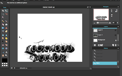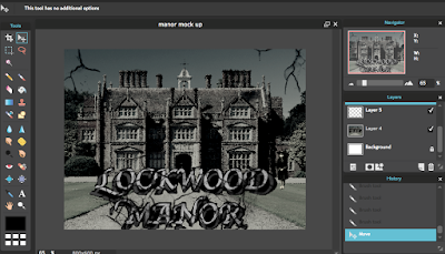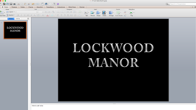
To determine the typography for my horror film I used powerpoint to use the image to put onto pixlr. I used Adobe Caslon Pro Bold to begin with and expanded on it by changing the colour to a bold, gradient silver. Additionally I enlarged it to size 80 to make it stand out.

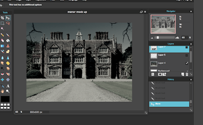
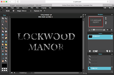
Once I had taken the image and put it into pixlr I used the brush tool to remove parts of the letters and blur the images. I then took the brush number 112 and placed them on the edge of the letters to remove parts of the word.
From my questionnaire I found out that most people found a spooky house to be best on a horror poster so my film is based around a large, haunted manor house. The title Lockwood Manor was edited to look like vines and trees are enclosing the letters. It could also be interpreted as being a dark grey sky. The use of a pathetic fallacy sets the scene instantly and lets the audience know what genre the film is going to be. Additionally, from my questionnaire Shutter was the more popular choice of film so I incorporated the dark colours into my title. The rest of the poster will have a black and silver theme through it with the use of the brush tool to create the vine effect, as if something is restricting you.
 For my second mock up typography I used Apple Chancery font and made the words size 96. I added a shadow behind the title and made the distance far away and faded to give a ghost effect. I also changed the font colour to red.
 I used the crack effect from the brush tool on the image to make the letters look distorted. I wanted the typography to look like it had cracks in as the building is old. I also brightened the colour to make it stand out more and sharpened the image.
I involved my focus group in my decision to see what they thought.
Keane: "I prefer the first one. The name sounds really spooky and the dark background makes it look like a horror film. It looks really dark and mysterious."
Gemma: "I like the red one better as it has the shadow in the background which clearly defines the genre and draws my attention. It also looks more professional."
Eve: "The red one looks scarier and I like the font more as it suits an old manor house."
Adam: "The red one is cool, but I like how the silver one looks like the night sky."
 For my semi final typography I merged the two together. I did this because I liked the style of my second idea but the colour of my first. I though that the second typography in red looked too much like a zombie or slasher horror so I changed the colour to silver.


