I began by choosing two images from the internet which can represent my real poster.
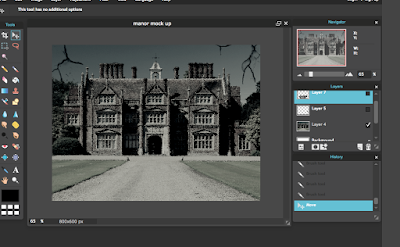
I edited the first image by changing the colours, lighting and distortion. I added the 'old photo' filter to create a dark look. I used the brush tool to add the cracks.
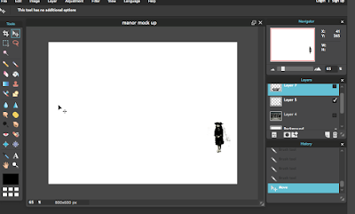
I used the wand and lasso tool to crop out the image of the elizabethan child. I made her smaller and then added her onto the background layer. Once I had done this I made the image of her darker to fit in with the background.
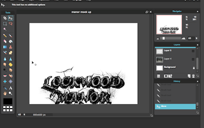
I also used the wand and lasso to crop around my typography. I added the cracks once it was on the background to blend the images together. I also used the blur tool to blend.
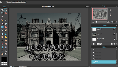
My final mock up looks like this. I don't think it looks professional enough and my typography doesn't stand out. I think that the house looks spooky however the image of the child doesn't look realistic nor is it notciable.


 I edited the first image by changing the colours, lighting and distortion. I added the 'old photo' filter to create a dark look. I used the brush tool to add the cracks.
 I used the wand and lasso tool to crop out the image of the elizabethan child. I made her smaller and then added her onto the background layer. Once I had done this I made the image of her darker to fit in with the background.
 I also used the wand and lasso to crop around my typography. I added the cracks once it was on the background to blend the images together. I also used the blur tool to blend.
 My final mock up looks like this. I don't think it looks professional enough and my typography doesn't stand out. I think that the house looks spooky however the image of the child doesn't look realistic nor is it notciable.
No comments:
Post a Comment