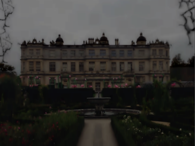
Here I darkened the image with the brightness and contrast tools. I then made the image appear more blue than green using the colour balance tool. I selected the sky using the lasso tool and make the sky dark on its own. I used the brush tool to create the crack effect in the corners. Finally, to created the blur look I used the gaussian blur filter. To make this image scarier I will remove the pink and make the house look older.
Firstly I edited this image by using the wand and lasso tool to cut around him. I then brought the brightness and contrast down. I also used the curve tool to make the image darker.
I put my typography and tagline onto my poster by using the wand tool and deleting the background. I darkened the whole image slightly as a whole and this is the result. I also edited the eyes of the boy by darkening them with the brush tool.
Here I blacked out the pink flowers usuing the brush tool. I the lightened the background image of the house so the poster will stand out more. I experimented with the curve tool to make the image of the book look darker in areas. I also experimented with the brush tool and added splatters and cracks to make the poster stand out from afar.
Using the free distort tool I pulled my image up to make it appear bigger. I black out to background using the fill and brush tool but keep some to and colored it red to add cracks. I blended them in to give the effect that they are creeping up on the house. I used the curve tool to find a good balance of light. I played around with the color balance, hue and saturation and contrast until I found the right level. I made the image bigger and distorted it again until it looked dominating. I think this is effective as it looks more like a poster.
I think the sky looks very effective here.
I distorted the image and pulled the contrast right up and the brightness down to get this look.
I played around with the lighting and saturation until I got a dark image. I distorted the image up a lot so it had a daunting feel to it. I used the filter glamour glow to make it slightly blurry.
This image looks more sinister as he is smiling.
To get this image I used the curve tools and contrast to create a bright but sinister look. I maintained the viability of his facial features apart from the eyes which I blackened out.
Here I turned the contrast up and used the curve tool to make the clouds more visible. I distorted the image to make it more imposing using the free distort tool.
Here I used three images i previously edited and brought the brightness down on all of them. I put my tagline, title and credits on the poster and used the brush tool with low opacity to get the dark effect around the sides.
Poster tweaked.
Possible idea for teaser poster or main campaign.


No comments:
Post a Comment