Thursday, 4 February 2016

Mock Up Images for Poster


Here I darkened the image with the brightness and contrast tools. I then made the image appear more blue than green using the colour balance tool. I selected the sky using the lasso tool and make the sky dark on its own. I used the brush tool to create the crack effect in the corners. Finally, to created the blur look I used the gaussian blur filter. To make this image scarier I will remove the pink and make the house look older.
Firstly I edited this image by using the wand and lasso tool to cut around him. I then brought the brightness and contrast down. I also used the curve tool to make the image darker.


I put my typography and tagline onto my poster by using the wand tool and deleting the background. I darkened the whole image slightly as a whole and this is the result. I also edited the eyes of the boy by darkening them with the brush tool.


Here I blacked out the pink flowers usuing the brush tool. I the lightened the background image of the house so the poster will stand out more. I experimented with the curve tool to make the image of the book look darker in areas. I also experimented with the brush tool and added splatters and cracks to make the poster stand out from afar.

This is the image with the new typography.


 Using the free distort tool I pulled my image up to make it appear bigger. I black out to background using the fill and brush tool but keep some to and colored it red to add cracks. I blended them in to give the effect that they are creeping up on the house. I used the curve tool to find a good balance of light. I played around with the color balance, hue and saturation and contrast until I found the right level. I made the image bigger and distorted it again until it looked dominating. I think this is effective as it looks more like a poster.
I distorted the image a lot more and used the color tool to create the blue / green effect in the sky. I also added cracks to give the effect of a storm. I darkened the image and I think it looks very effective.


I think the sky looks very effective here.


 I distorted the image and pulled the contrast right up and the brightness down to get this look.
 I played around with the lighting and saturation until I got a dark image. I distorted the image up a lot so it had a daunting feel to it. I used the filter glamour glow to make it slightly blurry.


This image looks more sinister as he is smiling.


To get this image I used the curve tools and contrast to create a bright but sinister look. I maintained the viability of his facial features apart from the eyes which I blackened out.
Here I turned the contrast up and used the curve tool to make the clouds more visible. I distorted the image to make it more imposing using the free distort tool.


Here I used three images i previously edited and brought the brightness down on all of them. I put my tagline, title and credits on the poster and used the brush tool with low opacity to get the dark effect around the sides.


Poster tweaked.


Possible idea for teaser poster or main campaign.


Tuesday, 2 February 2016

Mock Up Images for Teaser Poster


For this image I used the lasso tool to crop out the body and face and used them as a seperate layer in order to make her face look brighter. I used the curve tool to make the face look really bright. I widened her mouth to make it look like she is really screaming by using the buldge tool. On the other layer I played with the brightness to make the background look darker. I then used the brush tool to create the white dirt effect around the sides.
For this image I used the free distort filter to create the illution that she is being seen through the eye of someone else. This is effective to the audience because it looks like she is afraid of them, or something behind them. I brightened her face and bulged her mouth slightly too.


To make this image look dark I exaaggerated the curve tool until the background was black. I then adjusted the brightness to make the image look mysterious.


I edited this image by making it very bright. I used the glamour glow filter to make him appear as a ghost.


I used the image of the boys face and pulled the brightness down to make him look sinister. I removed his freckles with the blemish tool as they made him appear cute and innocent.
I added the typography, date and credits to this image and made the face smaller. I also used the curves and color tool to get better lighting.
Teaser mock up tweaked.


To get this image I played around with the contrast and brightness. I made the image look greener using the curve tool. I whitened his eyes by using the brush tool at a very small size to create a creepy look.


Here I used the glamour glow filter on the face of the boy so it looks less like a photo.                                                                                                                                                      


Monday, 1 February 2016

Tagline Design

For my tagline I decided to have it all in white to stand out and to match my theme. I used the 'American Typewriter' font and enlarged the two most important letters. The use of the word 'you' gives the tagline a directive.

Thursday, 28 January 2016

Images for Teaser Poster

For my teaser poster I am using a face with a terrified look staring at the camera as if the camera is the antagonist. These are some ideas I have:

I have taken here an image from a medium height close to the face. Her expression doesn't look like she is scared.
Here I wanted her to look into the distance as if she is hiding from something. Her arms are covering her body for safety.
I like this image. The camera is higher than her and her face is shocked. I think this will be a good image to manipulate.
I also like this image because her face is looking elsewhere intriguing the audience.
The camera is at a higher height here and shows the face clearly. Her eyes are looking straight into the camera with a worried expression on her face.
The camera is at an extreme close up but may not work too well as she is the victim, not the antagonist.
Here she looks vulnerable and small to the audience.

Tuesday, 26 January 2016

Images for Poster

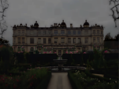
Here is an image of Longleat I took a while back. I think it is perfect for the manor idea I have.

Here I took images at a low angle to make him seem powerful to the audience.
On this image the background is brighter than his face however being able to see his face makes it scarier.

Typography Final

For my final typography I used Blackmore LET and Impact. I added a glow to the back of the work LOCKWOOD to make it looks more 3D. I then used a double wave transform on the word MANOR.
I used the brush tool to create the affect of trees and branches suffocating the words. I then used the rubber tool to create a tree like look. I also removed part of the letters in MANOR. I think this is effective as the branch has polysemic meanings. It could signify the woods, lightening or cracks in the house.

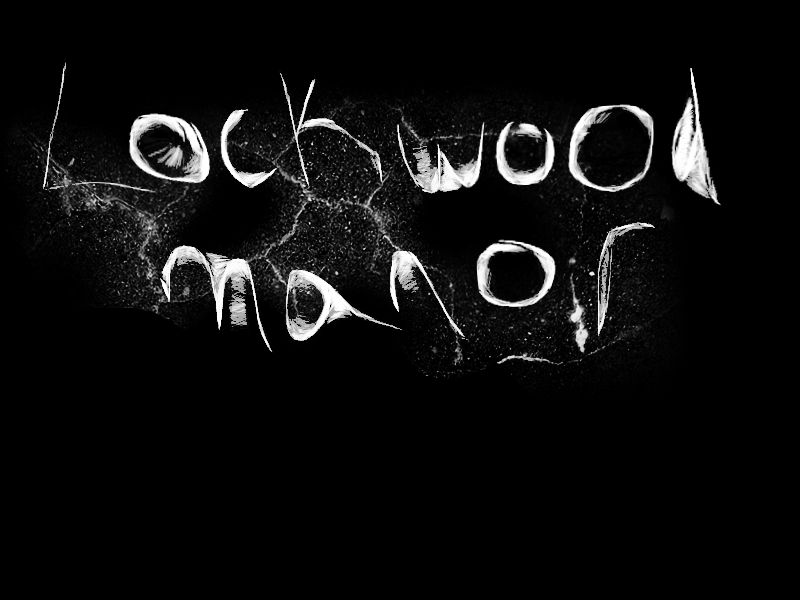
Using the pencil tool on pixlr I wrote the title making deliberate mistakes to make it look like a child's handwriting. I adjusted the curves to make the white stand out more. I then used the brush tool and chose the cracks and added this behind to create a misty effect.


Thursday, 21 January 2016

Poster Mock Up

I began by choosing two images from the internet which can represent my real poster.


I edited the first image by changing the colours, lighting and distortion. I added the 'old photo' filter to create a dark look. I used the brush tool to add the cracks.

I used the wand and lasso tool to crop out the image of the elizabethan child. I made her smaller and then added her onto the background layer. Once I had done this I made the image of her darker to fit in with the background.

I also used the wand and lasso to crop around my typography. I added the cracks once it was on the background to blend the images together. I also used the blur tool to blend.

My final mock up looks like this. I don't think it looks professional enough and my typography doesn't stand out. I think that the house looks spooky however the image of the child doesn't look realistic nor is it notciable.